21 Ways to Teach with Echo360 – 19) Use Confusion Alerts to Review Teaching Delivery

Why should I use confusion alerts to review my teaching delivery?
We often rely on students to tell us when they are confused in class. They are required to put their hand up, shout out, or come to the front of the class after a lecture. But how representative is that student of the rest of the group, have many others remained silent, and wouldn’t it have been better to have known during the class when you could revisit a topic or begin a discussion with the group?
When using the engagement tools in Echo360, students can follow along with slides and, if confused at any stage, can click the flag button to declare their confusion. Instructors will see this flag with a notification number representing the count of any students who have marked that location or slide in the classroom as confusing. If checked during class, this information can provide vital feedback on whether students have struggled to understand any part of the session, and offers the opportunity to address it immediately. If time doesn’t permit a quick check or comment at the end of a class, it can be reviewed within the Echo360 environment after class and action taken by sharing a short screencast, posting a discussion question, or addressing the point in the next class.
How can I do that?
The confusion alert button is available to students through the Echo360 classroom, along with other engagement tools, when accessing any shared powerpoint slides during class, or catching up with recordings and slides after class. As an educator, the confusion analytics are available to view in a variety of places. Let’s examine each, and how they could be used with your teaching:
Alert icon
If you are presenting your slides in class using Echo360 then you may see a selection of icons in the upper menu bar. These include the same flag button that students can see, but may also include a red number counter ![]() . This number relates to how many students are confused on that slide. This updates in realtime, so if you see this number increasing rapidly you may wish to pause and find out why.
. This number relates to how many students are confused on that slide. This updates in realtime, so if you see this number increasing rapidly you may wish to pause and find out why.
Slide thumbnails
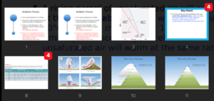
As you present your slides in Echo360 you may notice that hovering over the window reveals a grey icon centrally at the top of the slide ![]() . Clicking on the ‘grid icon’ (to the left of the slide number) reveals a thumbnail view of all your slides. This is particularly useful if you wish to quickly jump to another slide, and is commonly used by students to skip between slides during a class. You may also notice red icons with numbers attached to some slides (see below). These indicate that students have clicked to declare they are confused at that slide. It doesn’t say which students are confused, but you get an impression of how many.
. Clicking on the ‘grid icon’ (to the left of the slide number) reveals a thumbnail view of all your slides. This is particularly useful if you wish to quickly jump to another slide, and is commonly used by students to skip between slides during a class. You may also notice red icons with numbers attached to some slides (see below). These indicate that students have clicked to declare they are confused at that slide. It doesn’t say which students are confused, but you get an impression of how many.
This method is the best way to evaluate if there are any parts of your teaching that you may wish to revisit at the end of your class. Click on a slide and it will show the slide in full screen again.
Class hotspot maps
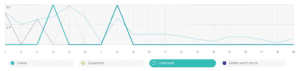
Echo360 engagement metrics are collated in the Analytics page to allow you to analyse your own teaching and the variation in student interaction. The metrics are displayed for each of your presentation slides (see below), across the whole timeline of any recorded class, and as a table of interactions for each student. Confusion levels can be easily seen in the Presentation view as a series of spikes; this information can help you understand how student engagement and confusion varies for the whole duration of a class.
Confusion leaderboard
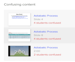
If you wish to reflect on which parts of your classes were most confusing, then the Confusion slides ‘leaderboard’ gives a handy overview. It shows a list of the slides that have received the most confusion clicks from across your whole programme module. Click on any slide to return to the recorded class and playback your commentary. This list may be helpful if you wish to improve your teaching for the next cohort of students.
Anything else I should be aware of?
All confusion ‘clicks’ by students are anonymised. This means that they can be more confident that their identity will not be revealed to teaching staff and their peers. Similarly, whilst you can monitor the gross number of alerts on your slides, using this method doesn’t allow you to support any individual students.
Choosing when to review the confusion analytics is entirely your choice as a teacher. Some prefer to check the numbers at the end of their lectures using the ‘slide thumbnail’ approach, whilst others might look at the ‘class hotspot maps’ or ‘confusion leaderboard’ after class.
When using digital tools in class it helps to explain their purpose, your expectations for students using them, and how you intend to respond to them. Using the confusion alert is no different.
It is useful to remember that the confusion alerts can be a reminder that perhaps a part of your teaching is not as clear as it could be. Reflecting on the analytics, playing back the commentary, noting any Q&A posts at that time, but especially, discussing the confusion with them, can give insights to help you improve how you deliver that part of a class in future.
Does it work?
When Professor Colin Montpetit introduced the Echo360 engagement tools to his genetics course in 2014 at the University of Ottawa he was already a confident user of response systems, but wished to experience the additional impact of the discussion and confusion tools. What he experienced was participation rates of up to 99%, note-taking rose, and questions posted by students increased. There was also significant evidence of an impact on learning, with the final exam average increasing (~68% to ~75%), resulting in a greater proportion of B to A+ grades and, naturally, a lower proportion of lower grades. Colin also monitored the Confusion alerts during his course. The chart below illustrates the level of student confusion across each of his teaching sessions. It is clear that the number of flags and number of students clicking the alert button was initially high in the earlier sessions, but there are considerably fewer in both categories beyond session 10 – though session 14 must have been an interesting class! This data likely reflects time required by students to adjust to a new topic or teaching approach, and is often assumed or overlooked when data isn’t readily available. Having this data helped Colin to subtly adapt this teaching and activities throughout the course, for example by adding more screencasts, posing different discussion questions and adding in additional polling questions.
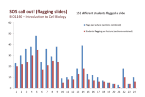
(From, Improving Student Participation in Large Lecture Classes, Montpetit, 2016)
In case you missed the previous posts in the series, here they are:
- Intro: A New Blog Series for Educators: 21 Ways to Teach with Echo360
- Part one: How to Record Your Class with Echo360
- Part two: How to Record an Asynchronous Screencast with Echo360
- Part three: How to Schedule Recordings of Your Classes with Echo360
- Part four: Lights, Camera, Action! Teaching and Live Broadcasting with Echo360
- Part five: Increasing Student Engagement: Creating Student Polls, Questions, and Other Activities
- Part six: Increasing Student Engagement: Facilitating In-Class Discussions and Group Work
- Part seven: Increasing Student Engagement: Delivering Live Interactive Teaching to Off-campus Learners
- Part eight: Increasing Student Engagement, Without Recording
- Part nine: Flip Your Teaching with Interactive Presentations
- Part ten: Flip Your Teaching with Seeded Discussions
- Part eleven: Flip Your Teaching with Screencasts
- Part twelve: Deliver Interactive Classes Using the PowerPoint Ribbon
- Part thirteen: Flip After Class with Discussions and Screencasts
- Part fourteen: Record in-class clinical procedures
- Part fifteen: Teaching to a class of distance learners
- Part sixteen: Facilitate discussions in small group teaching sessions
- Part seventeen: Create and Facilitate an Open, Online Course
- Part eighteen: Using Learning Analytics During my Class