New Reporting Dashboard Brings Real-Time Insights to Administrators & Institutions
One of the benefits of Echo360’s SaaS architecture is the ability to track usage activity across the entire video platform. When we launched our new cloud service several years ago, our initial focus was on providing instructors with classroom analytics to shed new light on their students. This valuable data has been used by thousands of teachers to help them to improve student outcomes in their classes.
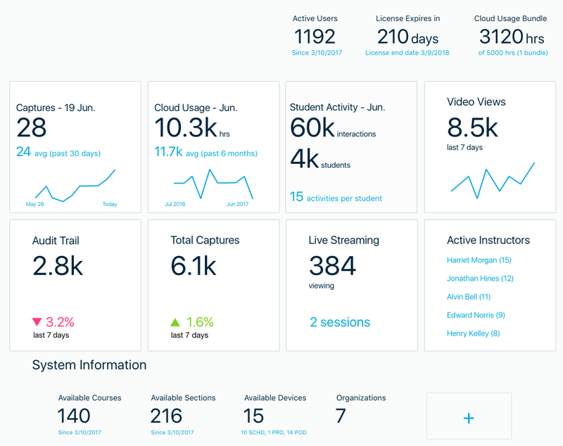
With its most recent release, Echo360 is now turning its focus to providing administrators with data to help them to track usage across their institutions. This new dashboard draws on modern UI design models for data, providing admins with a series of reports through a customizable interface. This UI displays quick ‘at a glance’ status across multiple indices, provides the ability to drill down into each report for greater detail, and can be configured by each user based on their preferences and needs.
The goal of this Dashboard is to make it easy for administrators to easily see the status of lecture capture and active learning activity across their institution to better understand how it is being used, help them to manage their platform, evaluate opportunities for increased use expansion, and assess the ROI of their deployment.
Some key benefits of the new dashboard will include:
- Data prioritization: The main view of the dashboard enables administrators to choose the metrics that matter most and order them by importance, providing a streamlined and customized view into the most relevant data at a glance.
- Data filtering: Administrators can also filter usage data by school or program, offering more specific insights into how academic video and student engagement tools are being used across the institution.
- Cards: Each key metric is presented to administrators with an up-to-date status on an easy to read card.
- Detail view: Administrators have the option to get a detailed view of each metric, broken down to help them understand how the system arrived at the current state, and can be filtered for more precise presentations.
- Data export: Administrators have the ability to easily export complete or filtered data for offline analysis and review.
For this initial release, the dashboard contains three active “cards,” each one representing a specific report and data stream. Users can also see several reports that are currently in development which are shown as grayed out cards. As you know, Echo360 employs an Agile development process with new releases coming out every two weeks, and our goal is to release these additional reports over the next several sprints. Lastly, there is also “feedback” card which provides an easy way for users to submit ideas for future reports, so please let us know. This new dashboard is tied into the rich data pipeline and analytics engine on the backend of Echo360, so the possibilities are practically endless.
We hope you find this new dashboard a good first step towards providing admins and institutions with insight they need on the Echo360 video platform, and we look forward to providing continued updates to enhance this solution going forward.
See what eCampus news has to say about our new dashboard.
Learn more about Echo360.