Putting Students First: Improving Usability & Accessibility in Echo360

Written by Bill Holding, Executive Vice President of Product.
Students use Echo360 up to seven times more than other standard video platforms. This is a reflection of the unique design of our solution that integrates class videos and presentations with additional study guides such as synchronized note-taking, a class discussion thread, and polling. Students are actively embracing this solution which assists their review of materials and makes classes more engaging. Moreover, research today is clearly showing that students who engage more with their learning materials are seeing better outcomes in their courses.
Echo360’s unified learner interface for this active learning experience is called the Echo360 Classroom. Given its success, you can imagine that we wouldn’t make changes to the Classroom on a whim. We track user feedback from instructors and students, and saw some areas for additional enhancements including increasing the overall accessibility and flexibility of the platform.
After several rounds of user feedback and design, we deployed our new Classroom interface last month, and so far the feedback from the Echo360 community has been quite positive. The new Classroom has some key advantages over the previous interface, including:
- Persistent navigation: The engagement tools in Echo360 are now easier to access, both during live class and video playback. Students can ask a question, flag confusing content, or to let their instructor know that they are struggling with a single click.
- Configurable playback: Students can now arrange their media feeds in the way that works best for their learning, including side-by-side playback, and instructors can arrange feeds to support live teaching or out-of-class engagement.
- Improved contrast: Improved contrast makes it easier for students with visual impairment to work with the application and their course content. The contrast has been improved across the platform, including engagement tools, views within the player, and activity slides.
The new design also opens up opportunities for new and enhanced learning tools on our roadmap, so it will make it easier for us to innovate with the platform without introducing more UI changes. And we are confident that some of our planned features will increase student engagement and adoption of the platform even more.
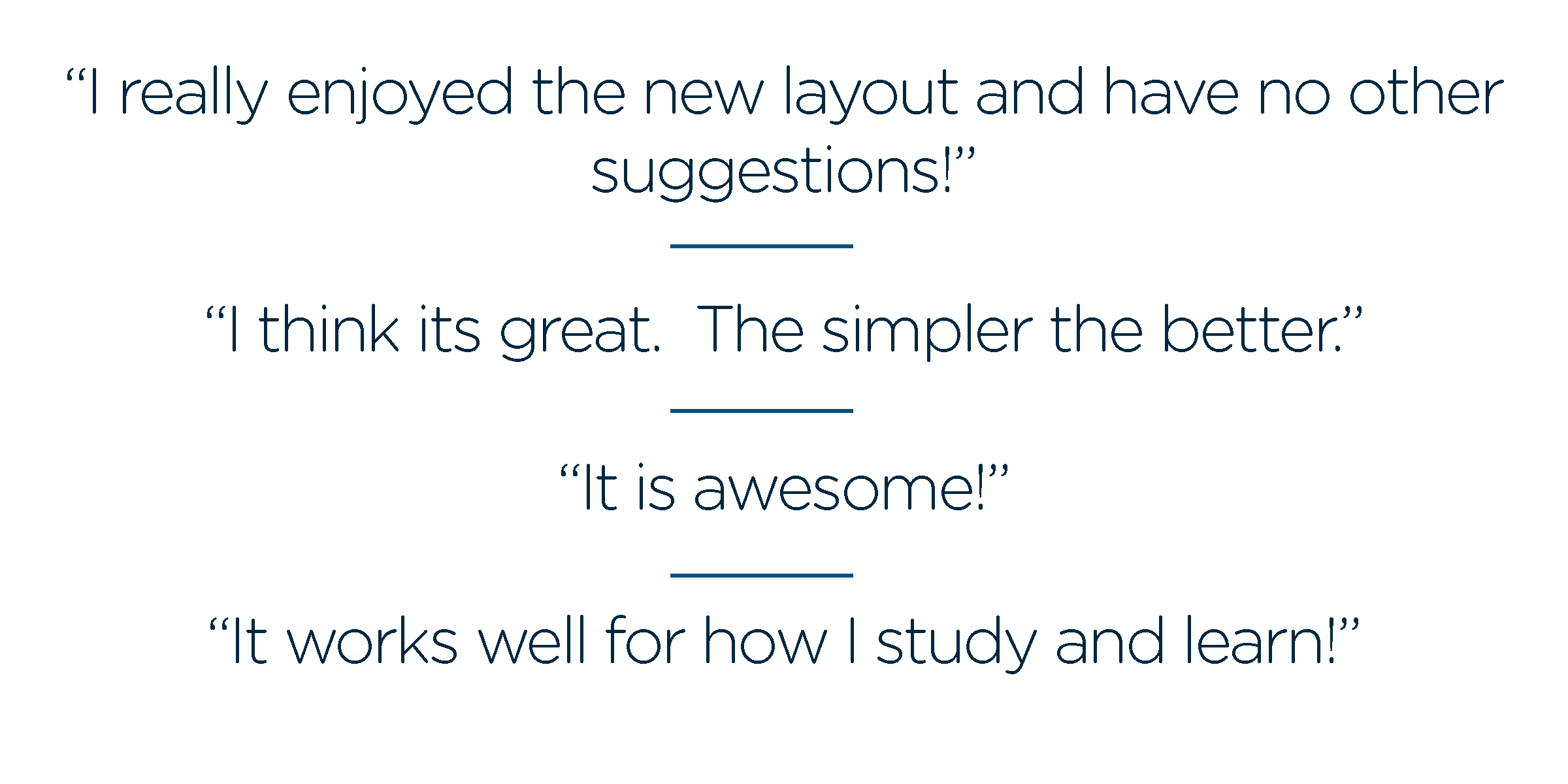
Initial student feedback from instructor surveys is quite positive. Here is what students are saying:
We hope you and your students are enjoying the enhanced classroom experience as much as these students are. If you haven’t seen it yet, be sure to log in and check it out today. It’s easy to add a poll, or ask a question of your class and these little efforts will all increase student engagement and learning.
Learn more about Echo360.


