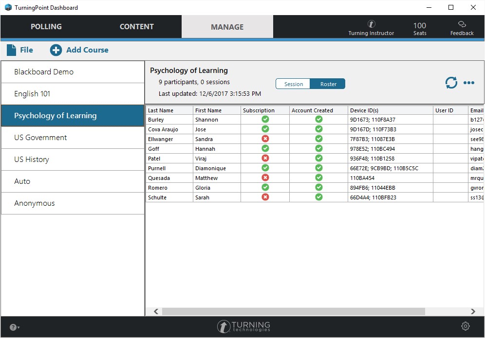
Interface updates make managing results even easier

In the latest version of Echo360Point, we unveiled an updated interface for the Content and Manage tabs. These updates will make management of results more intuitive, decrease on-screen clutter and reduce confusion for new users.
One of our favorite changes lives within the Manage tab. We know the time and effort you put into ensuring your students are correctly registered with Echo360 Technologies. This extra energy takes away from what is really important: student learning. Now, instructors can easily see which students are ready for class.
Just click the

button in the upper right corner to quickly email your students who are not completely registered.

Ready to look at the new changes first-hand? Select “Updated Interface” in your software preferences to view the changes. You can always revert to the old interface until you feel comfortable. Let us know what you think through the feedback button in the upper-right corner of your Echo360Point software!
