5 Strategies for Creating More Memorable Learning Content

Think about the last mandatory compliance course you completed for work. Other than the general topic, what specific facts and information can you recall? If there was an assessment at the end, could you pass it again weeks or months after taking the course? Unfortunately, the importance of a topic alone is often not enough to hold our attention. Chances are, at one time or another you’ve been guilty of checking email or even checking social media while simultaneously clicking through your employer’s mandatory training programs. As a designer, you might want to create better training programs and courses, to hold your learners’ attention and equip them to retain the information in their long-term memories and apply that knowledge on the job. This doesn’t have to be a dream; intentional design decisions can help make your learning content memorable and meaningful.
Strategy #1: Communicate why they are learning, not just what
Remember sitting in school and asking, “When am I ever going to have to use this?” When you were a child, your teachers promised that you would need to know their content someday. As adults in the workplace, your learners are now out in the “real world.” They likely have a pretty good idea of what they need to know. However, if you are introducing entirely new content or a new process, you might need to sell the concept to the learner as you deliver it. Communicate your objectives and explain to the learners why this content matters to them. If your training classes and programs simply present content with no explanation of why it matters, your learners may not make the necessary connections on their own.
Strategy #2: Make your learning content personal and relevant
Most content is not one size fits all. Even in the case of mandatory workplace compliance courses, do all employees benefit from receiving the exact same message? Can your content be tailored at all to suit the needs of different learners? For example, when presenting a topic such as bloodborne pathogens, consider creating a training course with branching scenarios based on learners’ roles or job responsibilities. Office employees likely face different risks than employees who work out in the field, and learners may be more receptive to your content if it feels relevant to their experiences on the job.
Strategy #3: Encourage critical thinking

Ban the “Next” button from your course. Challenge learners to resolve scenarios or complete simulations before they can progress through your course. Present content through interactions that require critical thought and not passive scrolling. Break up long video segments with knowledge checks. Anything you can do to encourage your learners to actually learn while they are taking your course means your content is more likely to be remembered. The levels of processing model state that the deeper learners process content, the more likely they are to remember it.
If you’re struggling to think of effective presentation methods, craft your learning objectives around the top tiers of Bloom’s Taxonomy. If learners have to apply and synthesize your content and not just perform simple recall, their higher levels of effort will be rewarded with higher levels of retention.
Strategy #4: Hold learners’ attention with good design
The overall look and feel of an online course are nearly as important as the content itself. Courses that are sophisticated in their design may be perceived as more valuable than courses that are dated or unprofessional in their appearance, no matter the similarities in their actual content. Implement design review into your course development process; go beyond simple branding and assess the overall impression learners will have of your course. Is the navigation intuitive? Are the colors and layout of your content pleasing to the eye? Is written content easily legible? Do you make sufficient use of whitespace so as not to overwhelm learners? Ask yourself questions such as these, but don’t worry if you are not a master of graphic design. Rapid design authoring tools such as knowbly™make it easy to design professional courses through the use of their pre-built templates and widgets, and relying on your authoring tool for design assistance allows you to focus on your content if graphic design is not your forté.
Strategy #5: Respect your learners
Treat your learners like the adults they are. Design decisions such as open navigation, allowing learners to complete your courses on the device of their choice, and even allowing them to test out of content all demonstrate your respect for their time and knowledge. Don’t discourage motivated learners by the ineffective presentation of content, poor design, and overall unpleasant experience. By taking the time to create meaningful learning experiences that present relevant content in engaging methods, learners will reward you with higher retention of your content.

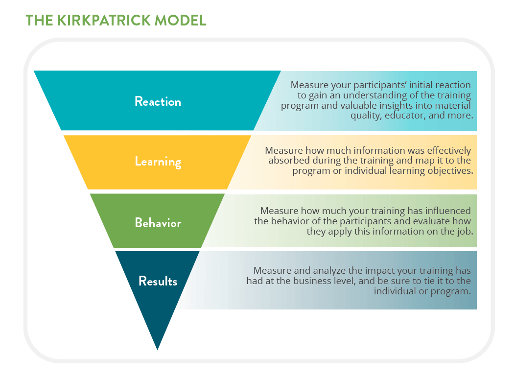
Consider the Kirkpatrick Model, commonly used in corporate training environments. Level 1 assesses how well learners liked the training. If learners are dissatisfied, they are less likely to be engaged, remember the content, or apply it on the job. Levels 2 and 3 assess if learning and behavior changes have occurred as a result of the training. Level 4, the highest step of the Kirkpatrick Model, determines the overall results of the training, which is how training teams demonstrate the return on the training investment.
Reflect on how respect for the learner may play a role at each level of this model, and ask yourself if learners who were not engaged or who felt disrespected by the content or presentation at any point are likely to retain the content, apply it on the job, or ultimately give their employer the intended outcome of the training.
